UWM-Illustration Gouache Painting
|
The worlds colliding
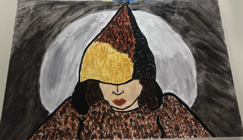
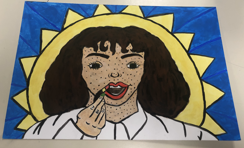
Illustration 30 X 40 cm December 2019 Exhibition Text This artwork "The worlds colliding" represents two pieces of myself to fit in the theme identity. That I will be following throughout all my art pieces. I wanted to represent a past version of myself that I always was. Then I wanted to show the positive change and growth that became of myself. The two pieces represent opposite personalities of myself. |
|
Planning
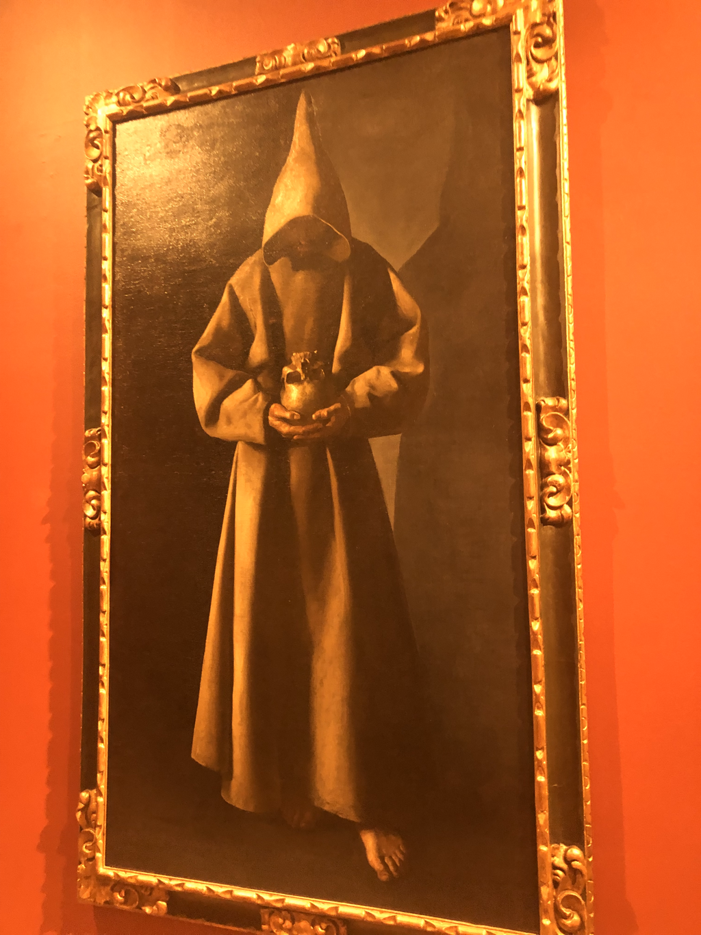
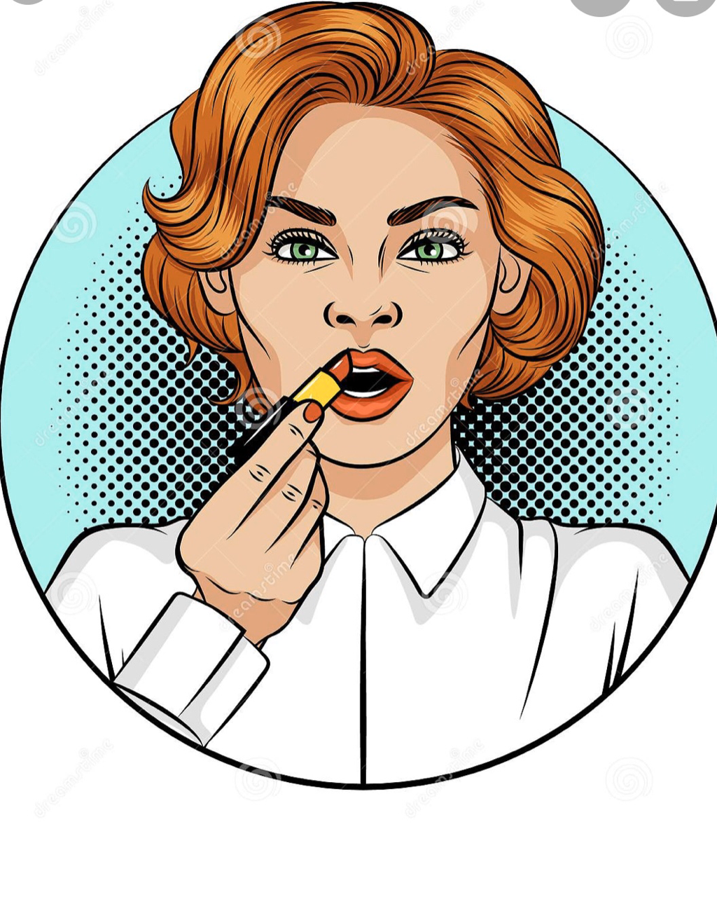
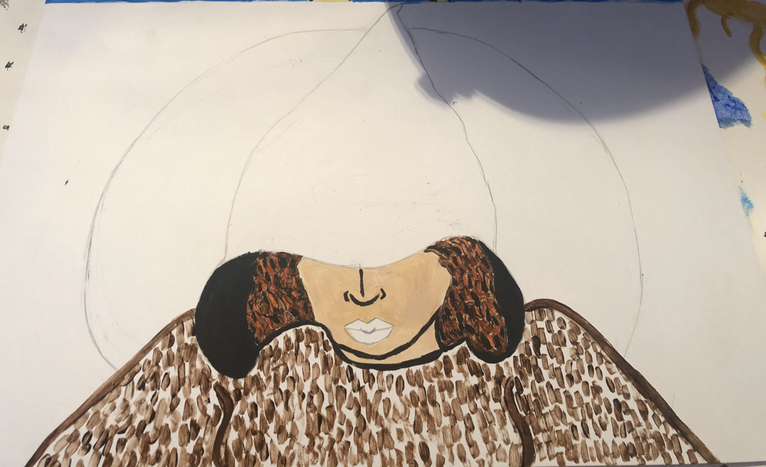
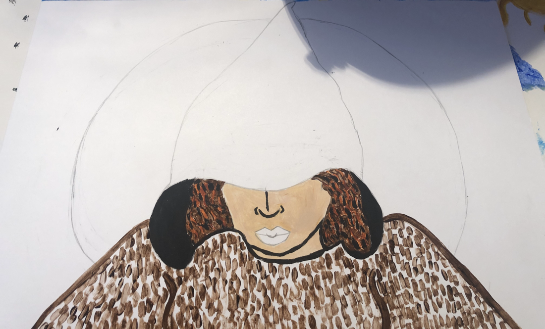
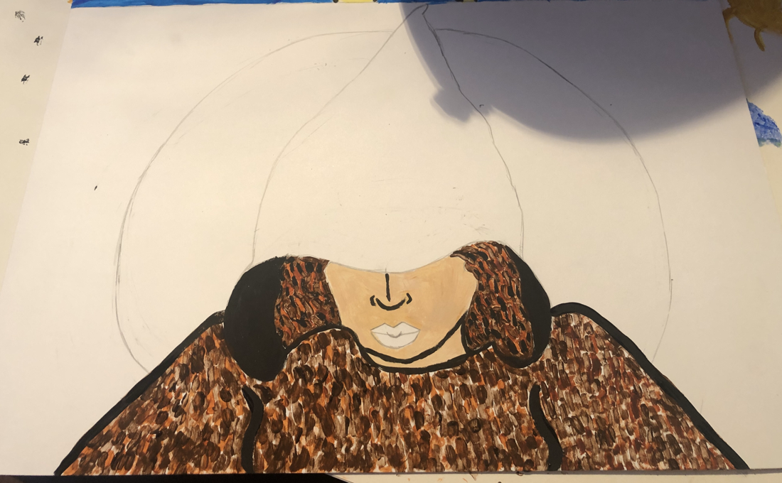
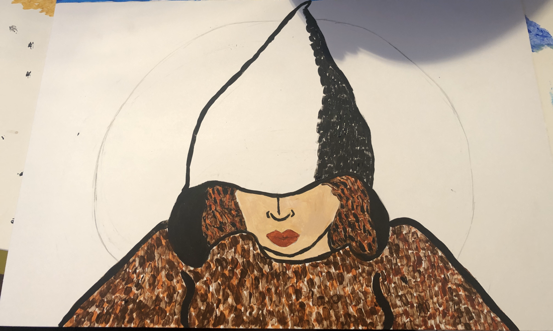
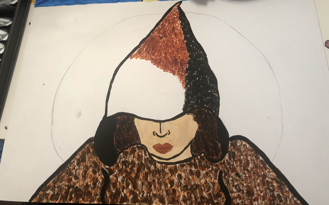
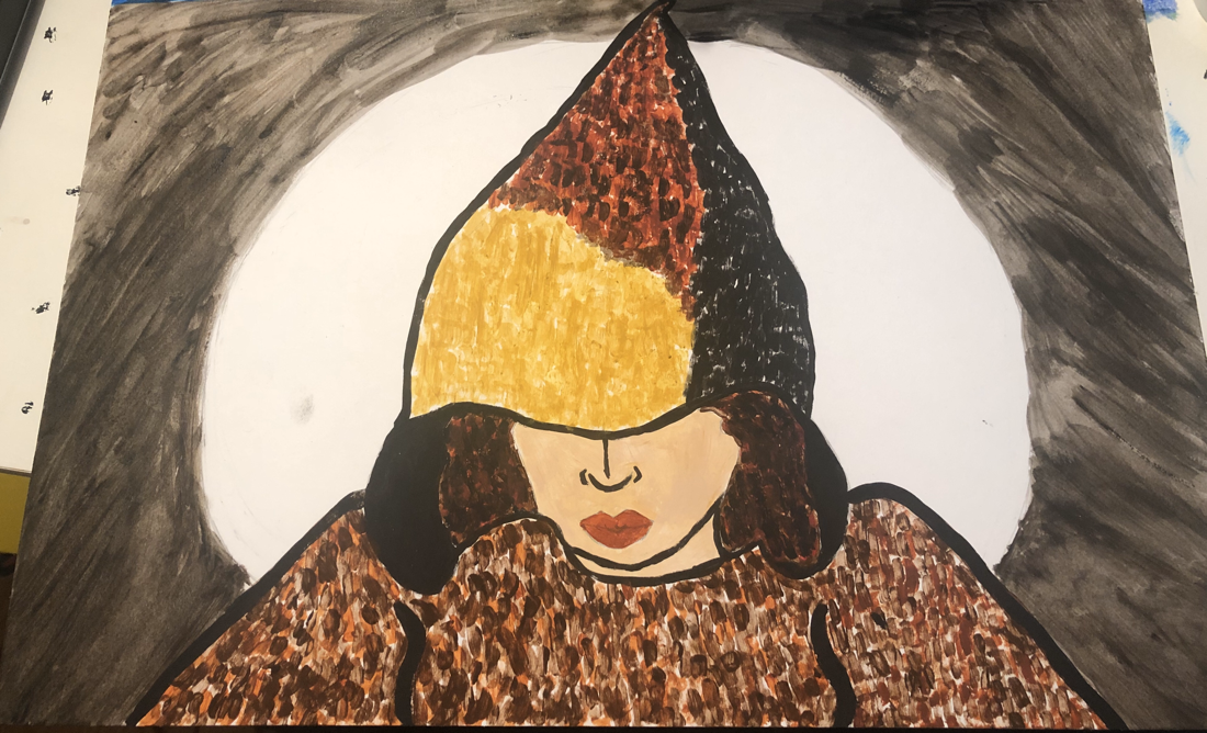
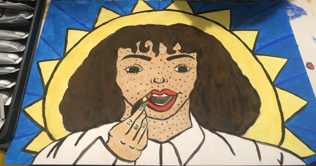
Inspiration For "The worlds colliding" I was inspired by very two different styles of art. I was also inspired by different techniques. The first piece was actually inspired by the artwork "Saint Francis of Assisi in his tomb". I saw this artwork on a field trip to the Milwaukee public museum. It's a huge painting and caught my eye right away, I liked the style and how the person was portrayed. I actually never thought I would be able to tie it in a actual art project for school, but it fit perfect for myself and the illustration. The original artwork portrays dark values and has many forms created because of the values. I thought it would be perfect for my style of techniques because I tend to focus on values and forms. I interpreted the piece as showing isolation and featureless space with loneliness. The man is very reserved and closed off, by being covered and showing little of his face. I thought this concept was perfect to show the shy reserved person I used to be for so long. The identity I had was closed off and I isolated myself from people and was never really outgoing until I got over being shy. The artwork 100 percent portrays that identity at the time. Since the two illustrations are meant to be opposite, I wanted to show that closed off person and the new growing outgoing person I became. I felt an art period that was known for being bold and happy like was pop art. I chose a piece that is from a artist in this generation to show the transformation of new worlds and identities of myself. I picked this piece "Girl applying a lipstick" because her facial expression shows a fierce look. Also the woman is the main focus and pops out. I really liked that because it shows that I don't mind being the center of attention and that I'm not closed off anymore. It shows the growth I had. Also I felt like the makeup concept matched, because I'm into makeup and I apply makeup when I get ready for a fancy event or for a really good outfit. It makes me feel ready and prepared and I feel that shows a different mentality than being closed off and not caring. Then I wanted to show my two inspirations of art techniques I used in the different artworks of "The worlds colliding" for my first piece that shows me closed off, I used line and value a lot to give off a harsher theme to it. I was inspired by Impressionism for it. I really like the line technique to show the space in the art and the harsh and thickness. I felt like it fit the theme very well for it and brought together the concept. Then my other technique I used for the pop art style was stippling, that is commonly used in pop art. I really like the stippling technique and felt it was compatible for the piece because the technique is softer and gives off a softer look. Which fits perfect for the concept of happiness and outgoing, to not show intimidation. |
|
Planning Sketches
|
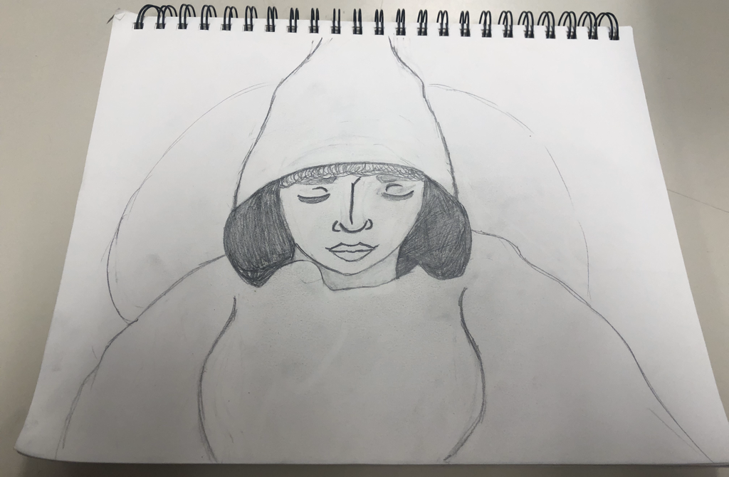
These are my ideas for the first piece of artwork. At first I started with the base as in the person and myself. I wanted to focus on the cloak first and make sure my details were matching with the original painting. Then I moved on to the face structure and how to import my features and myself in the drawing. I added my main features such as my bangs, lips, and skin tone. Then I portrayed the expression of the original painting. Then I came up with the idea of a moon in the background, to show a different kind of light. The moon is gonna be like a connection to the next piece. I wanted to show that light was there, but it wasn't that bright and kinda dim. The light from the moon, overall represents the happy outgoing personality that is going to appear. I chose a moon because the overall piece is gloomy like and has very dark contrasts like the original. Also I wanted to show another strong connection between the next piece.
|
|
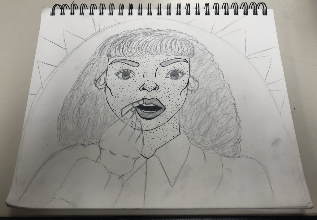
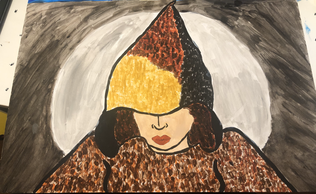
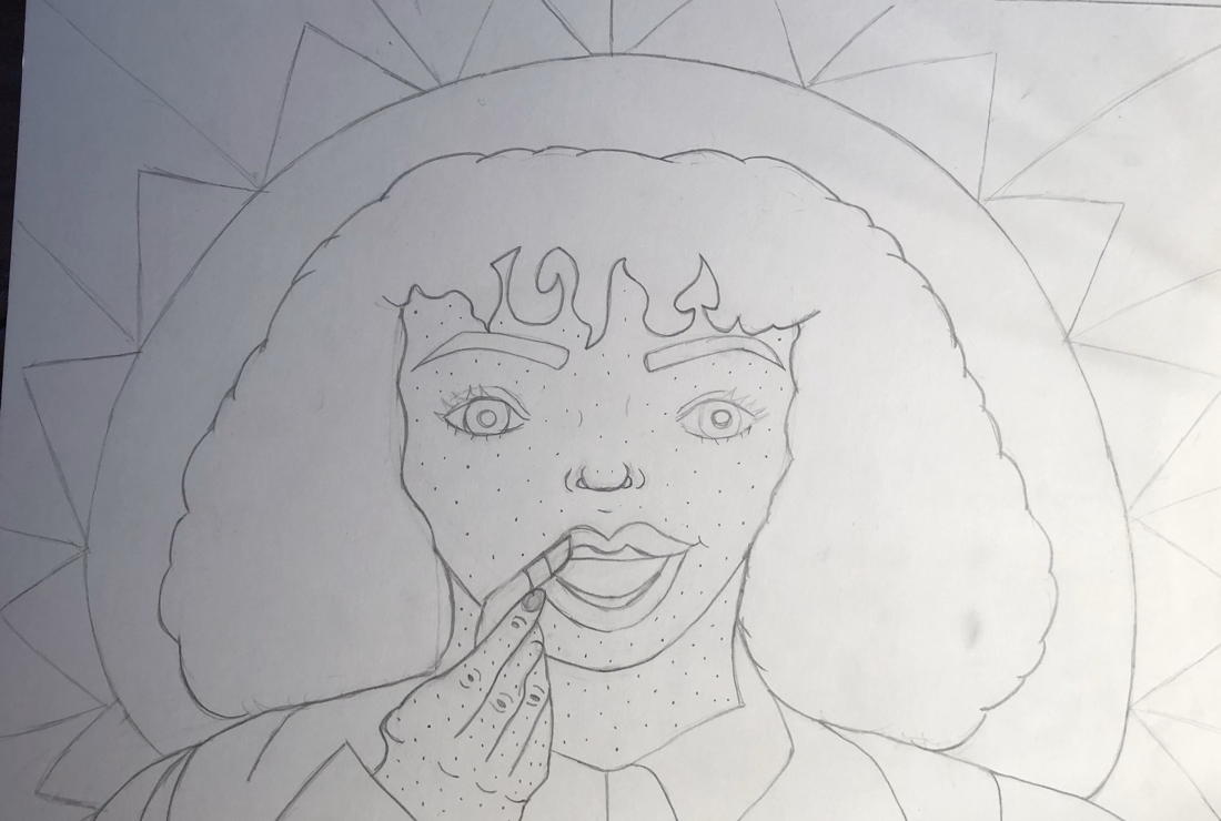
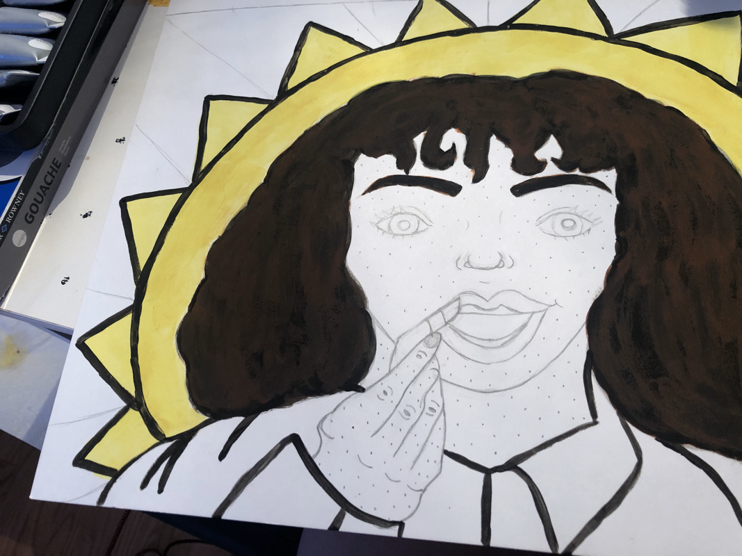
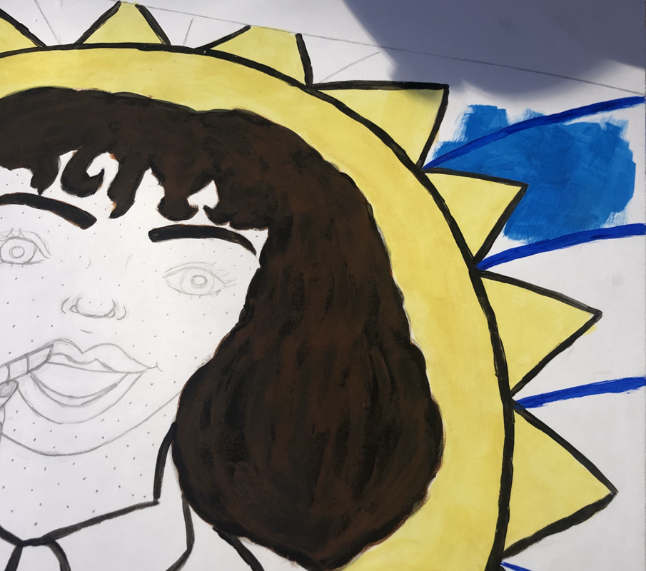
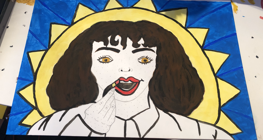
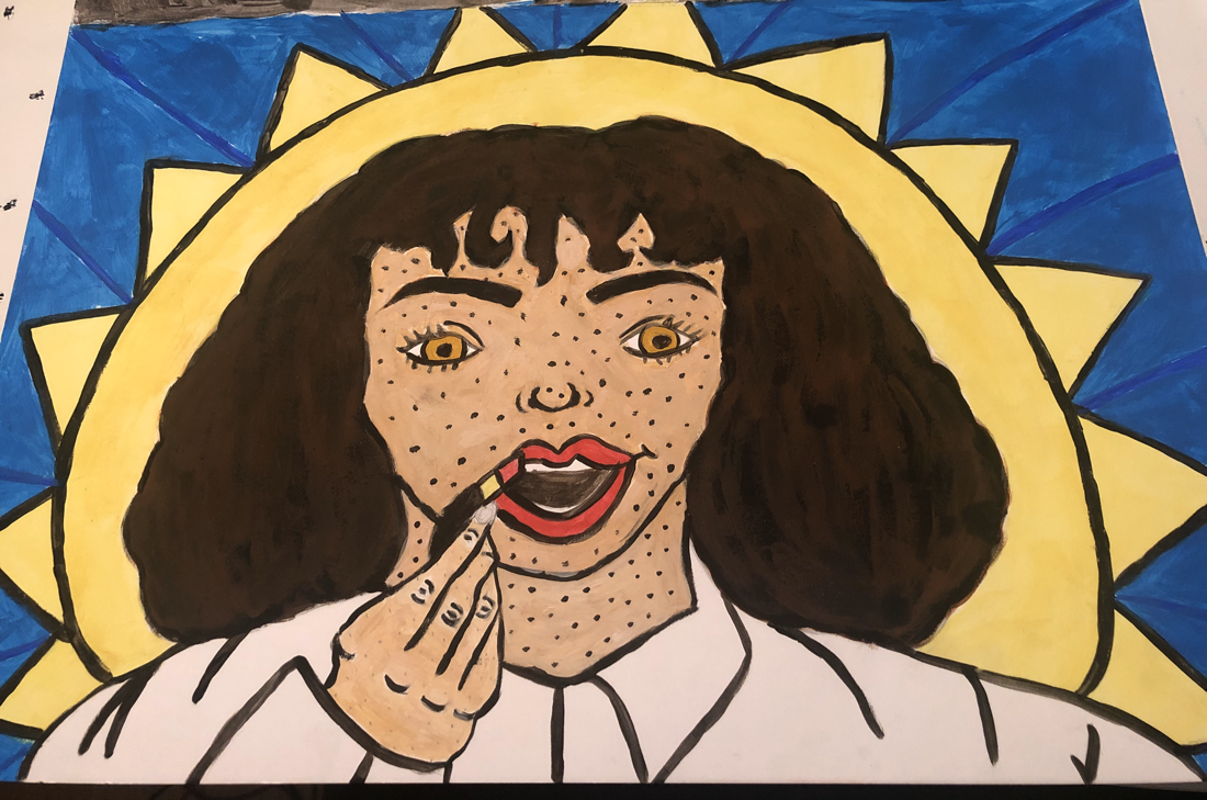
Then for my second piece I also focused on inserting myself to the piece. But I wanted to make it my style as well and add the important symbols. So for the circle background I wanted to turn it into a sun. I made that decision to show that the “light” from the first piece was now huge and surrounding me way more. I really wanted to portray the pop art style as well, so after I finished sketching I add dots to the skin with a 0.5 ink size pen. This technique is known as stippling. Then to even make the artwork more pop art, for the background behind the sun I made it pop with color and made it bold. I kept the original facial expression in the original piece, to show the new fierce identity I have. I also feel like the expression is bold, which I really liked.
|
|
Process
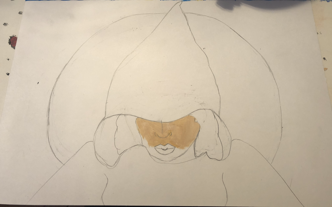
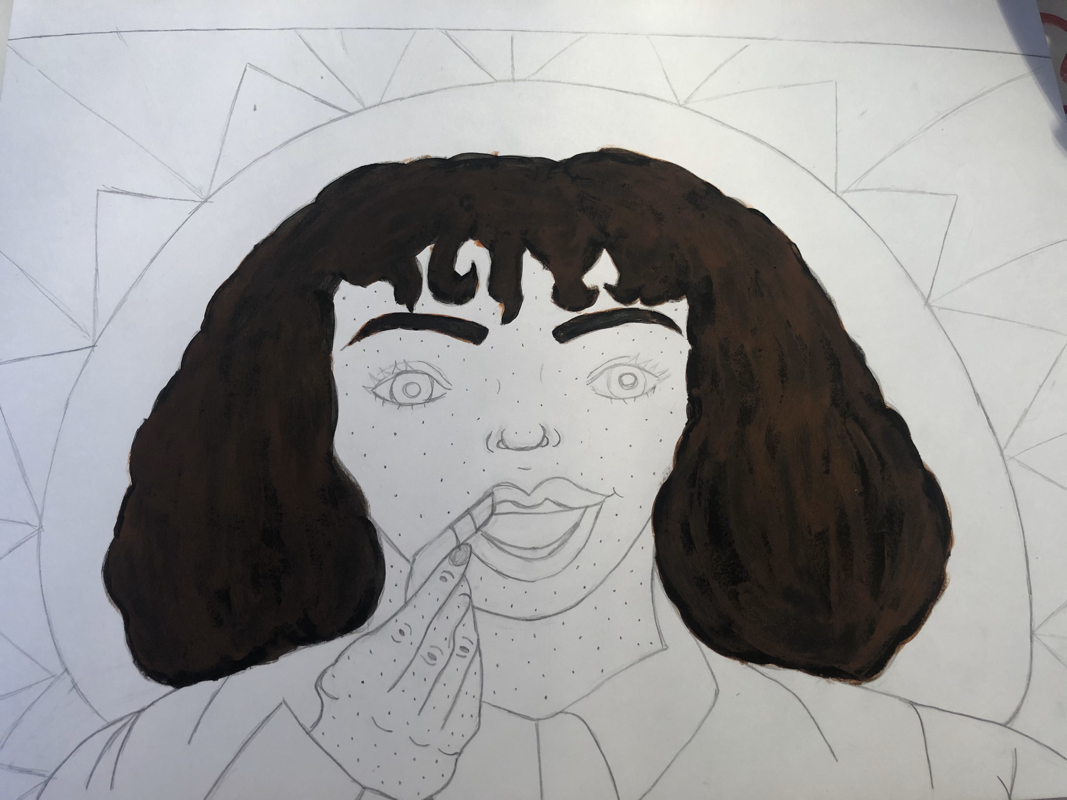
Experimentation For the first artwork I really experimented with textures and brush strokes. I wanted to pursue a impressionism texture like. But I wanted the lines to not be blended and more bold and rougher texture. Also for the background it's very shadow like, but I also have the light in the piece. So I experimented with the gradient of the light reflecting on me and the shadows. I also experimented with the value of the shadows and contrast due to the light. Then for my second painting I really experimented with the hair color and creating my skin tone. My hair color is a dark brown with red tints. So I started off with a reddish brown color, but I felt like it was too light and ginger like. So I mixed in dark brown and a black. Well the color came out too dark and I noticed that when I already painted the color on the board. I thought it would be a dark brown. But it came out as a black hue. So I added the reddish brown on top and painted with hair strand brush strokes. I did that technique to make the hair appear lighter and not as dark. Then I had to experiment on how to create my skin tone. My skin tone is fairly light with a tint of carmel like brown, but it's very faint in the winter. So I went through the steps of mixing a snow like white, a dark blue, bonfire red, saturated yellow, and a tint of pumpkin orange. But for white I used a lot of it to even everything out. |
|


Process
For my first artwork, I sketched the final product idea on the board on top. Then I started to make a orange like brown for the cloak. I started with painting the top of the cloak and wanted to make it crisp. Then I started with the bottom of the cloak and adding depth to the top and bottom of cloak. Then I wanted to work on the face afterwards because I knew it would take time. The background I knew for sure I wanted to do last because It would take time to do shadow like texture. For the background though, I started with the moon and transforming the moon to look like a moon. Then any mistakes I would make, I wanted to be able to cover it with the dark background hues. Then for my second painting, I actually did the opposite and started with the hair and background. I decided to do this because the background had lots of space more than the first painting. Also the second painting doesn't take much detail, just precision. So I painting the background after painting the hair, in case if I messed up on the hair. After I finished the background I moved on to outlining the shirt, and sun to make everything more bold and pop art like. Then I left the face, hands and skin tone last because I know it would be more tricky with blending and making everything be good before detail. So for the face I just started on things that I knew couldn't get messed up after painting on the skin tone. So I painted the lips, the lipstick, and lastly my eyes. After I finished with those details I added the skin tone and lastly did the stippling technique, but with paint.
For my first artwork, I sketched the final product idea on the board on top. Then I started to make a orange like brown for the cloak. I started with painting the top of the cloak and wanted to make it crisp. Then I started with the bottom of the cloak and adding depth to the top and bottom of cloak. Then I wanted to work on the face afterwards because I knew it would take time. The background I knew for sure I wanted to do last because It would take time to do shadow like texture. For the background though, I started with the moon and transforming the moon to look like a moon. Then any mistakes I would make, I wanted to be able to cover it with the dark background hues. Then for my second painting, I actually did the opposite and started with the hair and background. I decided to do this because the background had lots of space more than the first painting. Also the second painting doesn't take much detail, just precision. So I painting the background after painting the hair, in case if I messed up on the hair. After I finished the background I moved on to outlining the shirt, and sun to make everything more bold and pop art like. Then I left the face, hands and skin tone last because I know it would be more tricky with blending and making everything be good before detail. So for the face I just started on things that I knew couldn't get messed up after painting on the skin tone. So I painted the lips, the lipstick, and lastly my eyes. After I finished with those details I added the skin tone and lastly did the stippling technique, but with paint.


Reflection
Overall I really like the final product, I feel like it's more bold and crisp than the colored pencil version. But it was hard trying to recreate artwork I already did once. The final product didn't come out like my original art pieces and I felt like I was limited on colors. With colored pencils I have a more variety on the colors I create and mix or blend and I have a more variety on what colors I choose to use. So I was very disappointed in the colors of the paintings. For my pop art style piece I wanted a more of a turqoise blue instead of the dark sky like blue I got. I feel like even though I made changes to my artwork, I feel the viewers can still see the resemblance between my art pieces and the original. For my first artwork inspired by Francis in the tomb, I resembled the cloak and shadow like background. I really wanted this piece to be dark and hollow like the original. Then for my pop art piece, I really wanted to keep the bold open expression with the applying lipstick movement. I also wanted to keep the blue like background to keep the overall image bold.
Overall I really like the final product, I feel like it's more bold and crisp than the colored pencil version. But it was hard trying to recreate artwork I already did once. The final product didn't come out like my original art pieces and I felt like I was limited on colors. With colored pencils I have a more variety on the colors I create and mix or blend and I have a more variety on what colors I choose to use. So I was very disappointed in the colors of the paintings. For my pop art style piece I wanted a more of a turqoise blue instead of the dark sky like blue I got. I feel like even though I made changes to my artwork, I feel the viewers can still see the resemblance between my art pieces and the original. For my first artwork inspired by Francis in the tomb, I resembled the cloak and shadow like background. I really wanted this piece to be dark and hollow like the original. Then for my pop art piece, I really wanted to keep the bold open expression with the applying lipstick movement. I also wanted to keep the blue like background to keep the overall image bold.
ACT Responses
1) Clearly explain how you are able to identify the cause-effect relationships between your inspiration and its effect upon your artwork:
The inspiration that I took from really had a cause-effect relationship with my work, because a lot of things from my inspiration showed up in my pieces, along with how they were made and the skills and techniques I used to make them.
2) What is the overall approach (pov) the author (from research) has regarding the topic of your inspiration?
The overall approach the authors from my research have regarding my topic, are the textures and styles I used and created within the pieces.
3) What kind of generalizations and conclusions have you discovered about people, ideas, cultures, etc. while you researched your inspiration?
I made some pretty easy Generalizations and conclusions about ideas because I had to take some liberties with my research for the first illustration, as I wanted to convey a specific message
4) What was the central idea or theme around your inspirational research?
The central Idea was coming from a dark age in history and blossoming to a bright and happy and influenced future, the evolution of human mood and technology. The modern world vs the historic world
5) What kind of inferences did you make while reading your research?
Some inferences I made was how different the styles were. I saw how pop art was very bold and out there. That's exactly what I wanted for my pop art piece.
Bibliography
“From the Collection–Francisco De Zurbarán's Saint Francis of Assisi in His Tomb.” Milwaukee Art Museum Blog, 27 June 2017, blog.mam.org/2017/06/27/from-the-collection-francisco-de-zurbarans-saint-francis-of-assisi-in-his-tomb/.
Tamashova, Yana. “Vector Color Pop Art Comic Style Illustration Of Girl Applying A Lipstick. Stock Illustration - Illustration of Advertising, Adult: 130875604.” Dreamstime, 7 Nov. 2018, www.dreamstime.com/vector-color-pop-art-comic-style-illustration-girl-applying-lipstick-young-attractive-woman-does-makeup-beautiful-red-image130875604.
Tamashova, Yana. “Vector Color Pop Art Comic Style Illustration Of Girl Applying A Lipstick. Stock Illustration - Illustration of Advertising, Adult: 130875604.” Dreamstime, 7 Nov. 2018, www.dreamstime.com/vector-color-pop-art-comic-style-illustration-girl-applying-lipstick-young-attractive-woman-does-makeup-beautiful-red-image130875604.
